Techstack Design
Usually there is not enough space to show off every single skill in a regular CV. Especially not in a way that describes
how knowledgeable you are in a certain field and what you used technologies for.
I'd like to change this and provide a comprehensive list of everything, sorted in categories for easier navigation.
Whether you're a Developer, Engineer, HR, Recruiter, from a different field entirely or a non-tech-savvy friend who is just interested to have a look at the programming languages because they heard the word "Python", "HTML" and "JavaScript" before :D - everyone has different priorities for what they are looking for!
The goal of this page is to allow filtering of whatever is most important to you. This way you can easily find out if my skills meet your requirements.
First sketch
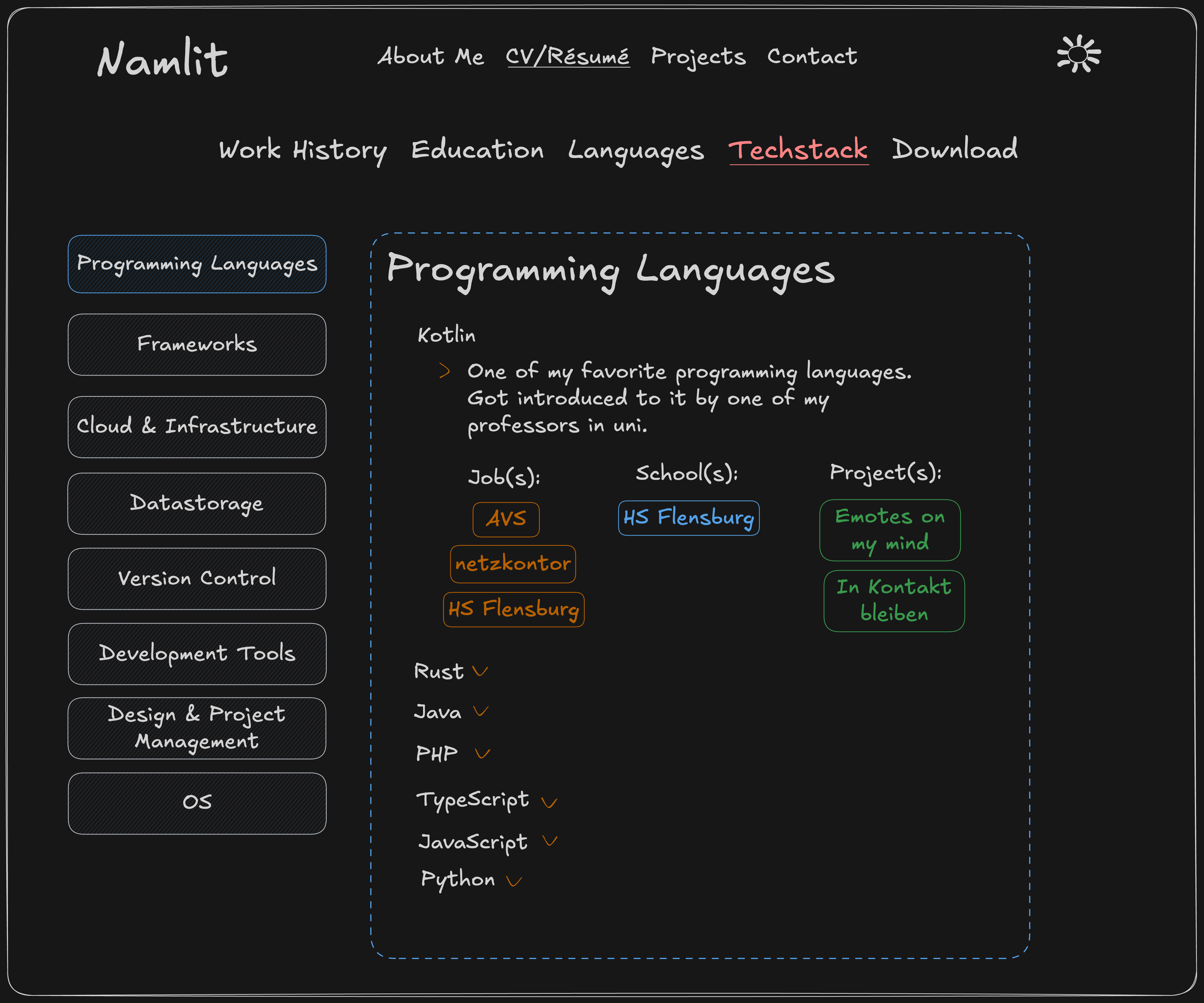
My first idea was to build a page with a navigation on the side showing all the Techstack categories. Upon selecting a category, the main content in the middle shows a list of items connected to the category. You can click on any of the items to receive additional details:
The goal is to have all the information available. But you should be able to select whichever item you are most
interested in.
Getting every single detail thrown at your face is irritating and inefficient for someone who just wants a small
overview and read about specific categories!
Advanced with nested Navigation and Categories
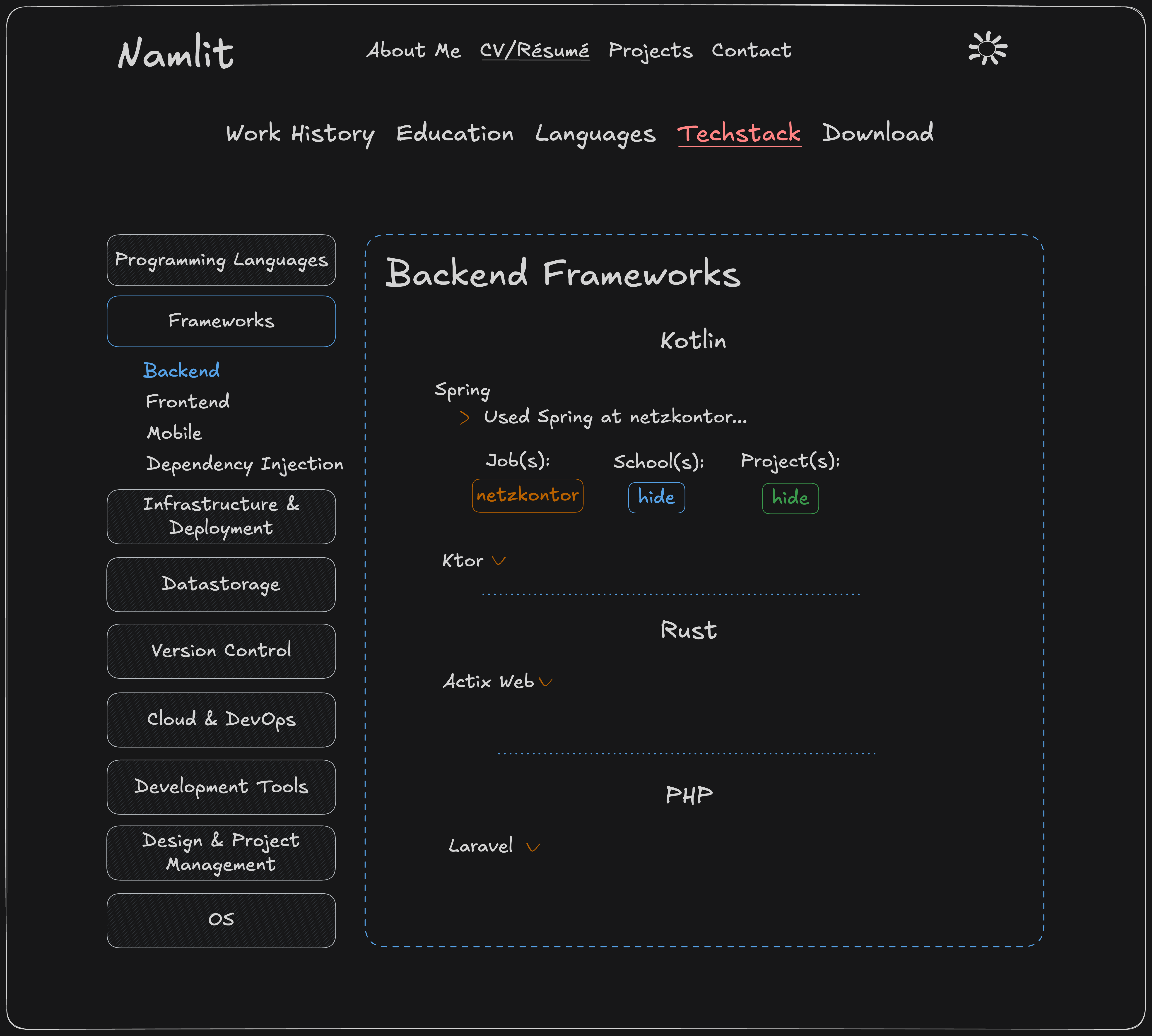
The initial sketch idea was great, but I wanted to add sub-categories as well: A single programming language can be used in many different scenarios. So splitting that up wouldn't make much sense. The same language could be in multiple categories, which leaves people confused, and it's also more difficult for myself to keep track!
If you think of frameworks however, they are usually more platform specific:
There are frameworks for backend services like Rust's Actix Web, frontend frameworks
like Svelte Kit to build websites, and mobile or cross-platform frameworks
like Flutter to build mobile apps.
I felt like having all of them in a single category wouldn't make much sense. So I developed the Nested Navigation Component to split them up.
Looking for specific backend frameworks should be much easier now :)
Mobile view
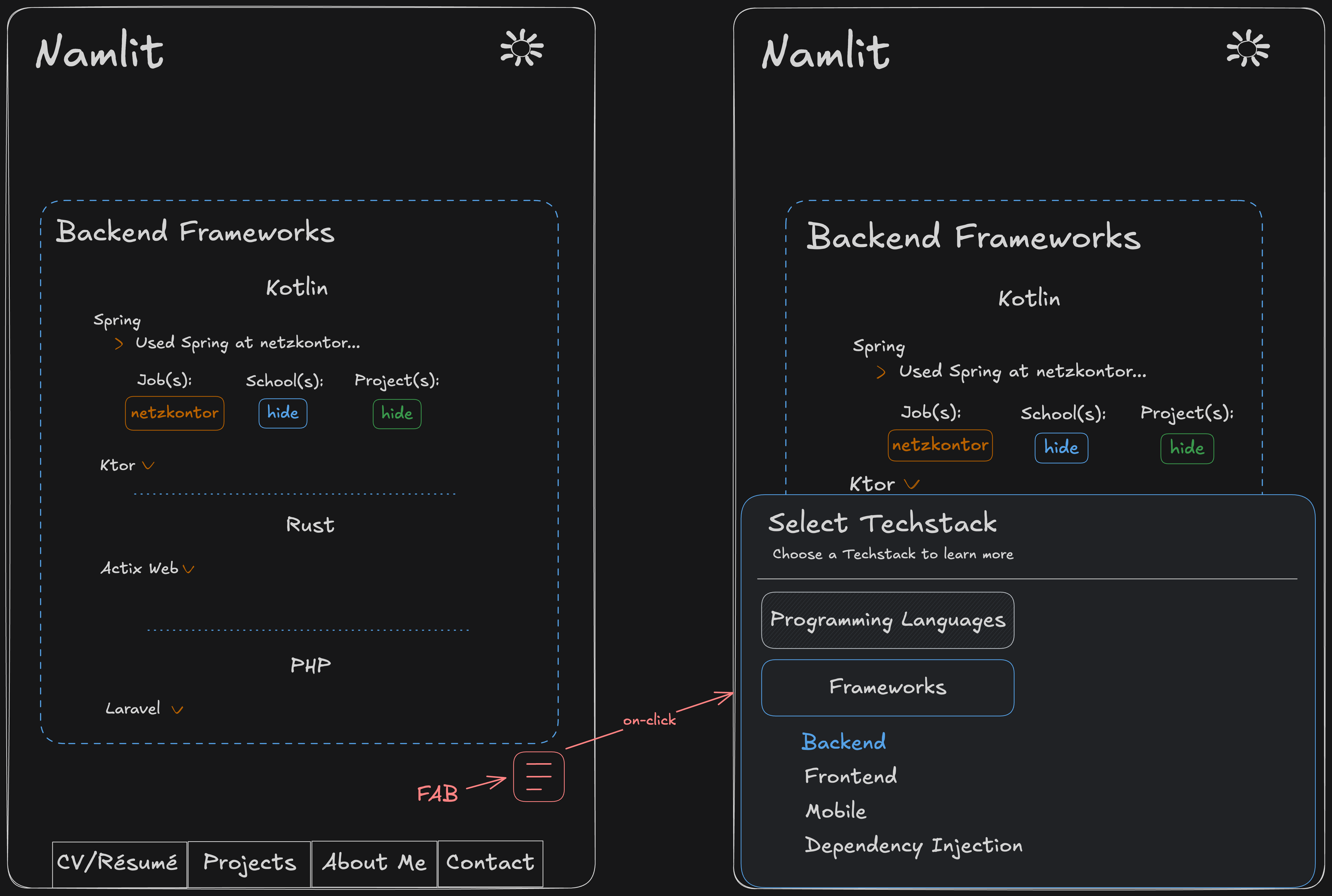
The aspect ratio on a mobile device is very different to the one on a desktop monitor. There is no space for the nested side navigation and content on a single page.
Therefore, I had to come up with a different solution. I liked the way the content was displayed. So the problem was finding a compromise for the user to have a good reading experience and smooth navigation through categories at the same time.
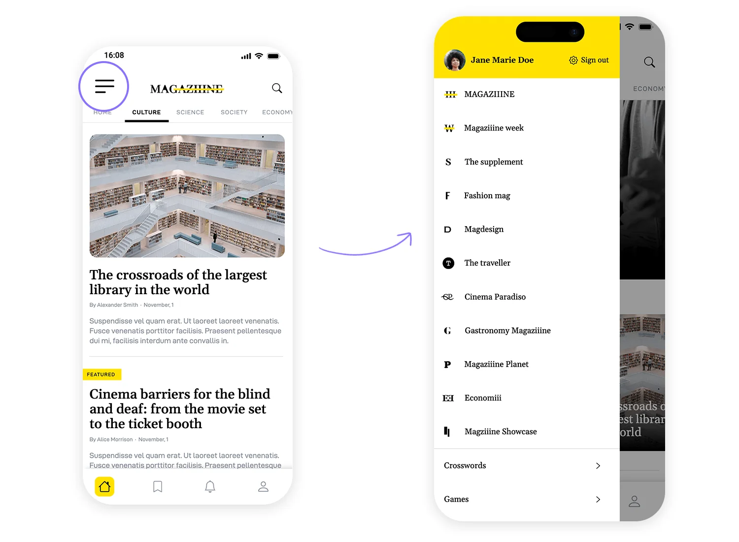
Many websites use a Drawer that comes in from the side after clicking a navigation button at the top of the screen: https://www.justinmind.com/blog/mobile-navigation/
This is definitely a valid approach, but I prefer not having to reach all the way to the top of the screen everytime I want to navigate.
So instead of having a side navigation, there is a FAB (Floating Action Button)! Clicking that button opens a Bottom Sheet and reveals the same Nested Navigation Component:
This design choice allows the user to navigate through categories a lot easier. Especially when holding your phone in one hand. Which makes sense because most pages on this website are for reading only and not to compose texts yourself.
Code
You will be able to find the code on my GitHub in the near future! First I have to get everything cleaned up tho before uploading v1.0.
Feel free to reach out if you have questions related to the design, coding and more anytime! I'd be happy to go over the code in my private GitLab too, while I haven't uploaded it here yet :)
Usually there is not enough space to show off every single skill in a regular CV. Especially not in a way that describes
how knowledgeable you are in a certain field and what you used technologies for.
I'd like to change this and provide a comprehensive list of everything, sorted in categories for easier navigation.
Whether you're a Developer, Engineer, HR, Recruiter, from a different field entirely or a non-tech-savvy friend who is just interested to have a look at the programming languages because they heard the word "Python", "HTML" and "JavaScript" before :D - everyone has different priorities for what they are looking for!
The goal of this page is to allow filtering of whatever is most important to you. This way you can easily find out if my skills meet your requirements.
First sketch
My first idea was to build a page with a navigation on the side showing all the Techstack categories. Upon selecting a
category, the main content in the middle shows a list of items connected to the category. You can click on any of the
items to receive additional details:
The goal is to have all the information available. But you should be able to select whichever item you are most
interested in.
Getting every single detail thrown at your face is irritating and inefficient for someone who just wants a small
overview and read about specific categories!
Advanced with nested Navigation and Categories
The initial sketch idea was great, but I wanted to add sub-categories as well:
 A single programming language can be used in many different scenarios. So splitting that up wouldn't make much sense.
The same language could be in multiple categories, which leaves people confused, and it's also more difficult for
myself to keep track!
A single programming language can be used in many different scenarios. So splitting that up wouldn't make much sense.
The same language could be in multiple categories, which leaves people confused, and it's also more difficult for
myself to keep track!
If you think of frameworks however, they are usually more platform specific:
There are frameworks for backend services like Rust's Actix Web, frontend frameworks
like Svelte Kit to build websites, and mobile or cross-platform frameworks
like Flutter to build mobile apps.
I felt like having all of them in a single category wouldn't make much sense. So I developed the Nested Navigation Component to split them up.
Looking for specific backend frameworks should be much easier now :)
Mobile view
The aspect ratio on a mobile device is very different to the one on a desktop monitor. There is no space for the nested side navigation and content on a single page.
Therefore, I had to come up with a different solution. I liked the way the content was displayed. So the problem was finding a compromise for the user to have a good reading experience and smooth navigation through categories at the same time.
Many websites use a Drawer that comes in from the side after clicking a navigation button at the top of the screen:
 https://www.justinmind.com/blog/mobile-navigation/
This is definitely a valid approach, but I prefer not having to reach all the way to the top of the screen everytime I want to navigate.
So instead of having a side navigation, there is a FAB (Floating Action Button)! Clicking that button opens a Bottom Sheet and reveals the same Nested Navigation Component:
This design choice allows the user to navigate through categories a lot easier. Especially when holding your phone in one hand. Which makes sense because most pages on this website are for reading only and not to compose texts yourself.
Code
You will be able to find the code on my GitHub in the near future! First I have to get everything cleaned up tho before uploading v1.0.
Feel free to reach out if you have questions related to the design, coding and more anytime! I'd be happy to go over the code in my private GitLab too, while I haven't uploaded it here yet :)
Techstack Design
Usually there is not enough space to show off every single skill in a regular CV. Especially not in a way that describes
how knowledgeable you are in a certain field and what you used technologies for.
I'd like to change this and provide a comprehensive list of everything, sorted in categories for easier navigation.
Whether you're a Developer, Engineer, HR, Recruiter, from a different field entirely or a non-tech-savvy friend who is just interested to have a look at the programming languages because they heard the word "Python", "HTML" and "JavaScript" before :D - everyone has different priorities for what they are looking for!
The goal of this page is to allow filtering of whatever is most important to you. This way you can easily find out if my skills meet your requirements.
First sketch
My first idea was to build a page with a navigation on the side showing all the Techstack categories. Upon selecting a category, the main content in the middle shows a list of items connected to the category. You can click on any of the items to receive additional details:
The goal is to have all the information available. But you should be able to select whichever item you are most
interested in.
Getting every single detail thrown at your face is irritating and inefficient for someone who just wants a small
overview and read about specific categories!
Advanced with nested Navigation and Categories
The initial sketch idea was great, but I wanted to add sub-categories as well: A single programming language can be used in many different scenarios. So splitting that up wouldn't make much sense. The same language could be in multiple categories, which leaves people confused, and it's also more difficult for myself to keep track!
If you think of frameworks however, they are usually more platform specific:
There are frameworks for backend services like Rust's Actix Web, frontend frameworks
like Svelte Kit to build websites, and mobile or cross-platform frameworks
like Flutter to build mobile apps.
I felt like having all of them in a single category wouldn't make much sense. So I developed the Nested Navigation Component to split them up.
Looking for specific backend frameworks should be much easier now :)
Mobile view
The aspect ratio on a mobile device is very different to the one on a desktop monitor. There is no space for the nested side navigation and content on a single page.
Therefore, I had to come up with a different solution. I liked the way the content was displayed. So the problem was finding a compromise for the user to have a good reading experience and smooth navigation through categories at the same time.
Many websites use a Drawer that comes in from the side after clicking a navigation button at the top of the screen: https://www.justinmind.com/blog/mobile-navigation/
This is definitely a valid approach, but I prefer not having to reach all the way to the top of the screen everytime I want to navigate.
So instead of having a side navigation, there is a FAB (Floating Action Button)! Clicking that button opens a Bottom Sheet and reveals the same Nested Navigation Component:
This design choice allows the user to navigate through categories a lot easier. Especially when holding your phone in one hand. Which makes sense because most pages on this website are for reading only and not to compose texts yourself.
Code
You will be able to find the code on my GitHub in the near future! First I have to get everything cleaned up tho before uploading v1.0.
Feel free to reach out if you have questions related to the design, coding and more anytime! I'd be happy to go over the code in my private GitLab too, while I haven't uploaded it here yet :)
Usually there is not enough space to show off every single skill in a regular CV. Especially not in a way that describes
how knowledgeable you are in a certain field and what you used technologies for.
I'd like to change this and provide a comprehensive list of everything, sorted in categories for easier navigation.
Whether you're a Developer, Engineer, HR, Recruiter, from a different field entirely or a non-tech-savvy friend who is just interested to have a look at the programming languages because they heard the word "Python", "HTML" and "JavaScript" before :D - everyone has different priorities for what they are looking for!
The goal of this page is to allow filtering of whatever is most important to you. This way you can easily find out if my skills meet your requirements.
First sketch
My first idea was to build a page with a navigation on the side showing all the Techstack categories. Upon selecting a
category, the main content in the middle shows a list of items connected to the category. You can click on any of the
items to receive additional details:
The goal is to have all the information available. But you should be able to select whichever item you are most
interested in.
Getting every single detail thrown at your face is irritating and inefficient for someone who just wants a small
overview and read about specific categories!
Advanced with nested Navigation and Categories
The initial sketch idea was great, but I wanted to add sub-categories as well:
A single programming language can be used in many different scenarios. So splitting that up wouldn't make much sense.
The same language could be in multiple categories, which leaves people confused, and it's also more difficult for
myself to keep track!
If you think of frameworks however, they are usually more platform specific:
There are frameworks for backend services like Rust's Actix Web, frontend frameworks
like Svelte Kit to build websites, and mobile or cross-platform frameworks
like Flutter to build mobile apps.
I felt like having all of them in a single category wouldn't make much sense. So I developed the Nested Navigation Component to split them up.
Looking for specific backend frameworks should be much easier now :)
Mobile view
The aspect ratio on a mobile device is very different to the one on a desktop monitor. There is no space for the nested side navigation and content on a single page.
Therefore, I had to come up with a different solution. I liked the way the content was displayed. So the problem was finding a compromise for the user to have a good reading experience and smooth navigation through categories at the same time.
Many websites use a Drawer that comes in from the side after clicking a navigation button at the top of the screen:
https://www.justinmind.com/blog/mobile-navigation/
This is definitely a valid approach, but I prefer not having to reach all the way to the top of the screen everytime I want to navigate.
So instead of having a side navigation, there is a FAB (Floating Action Button)! Clicking that button opens a Bottom Sheet and reveals the same Nested Navigation Component:
This design choice allows the user to navigate through categories a lot easier. Especially when holding your phone in one hand. Which makes sense because most pages on this website are for reading only and not to compose texts yourself.
Code
You will be able to find the code on my GitHub in the near future! First I have to get everything cleaned up tho before uploading v1.0.
Feel free to reach out if you have questions related to the design, coding and more anytime! I'd be happy to go over the code in my private GitLab too, while I haven't uploaded it here yet :)